Nike ‘testing options’ for MLB uniform sweat issues
Nike exploring options to fix MLB jerseys after sweat stains irk fans: Report players visibly sweat through jerseys
The MLB says adjustments to certain elements of the new uniforms are being explored for teams and players
By Julia Elbaba • •
Major League Baseball is having another jersey problem in 2024.
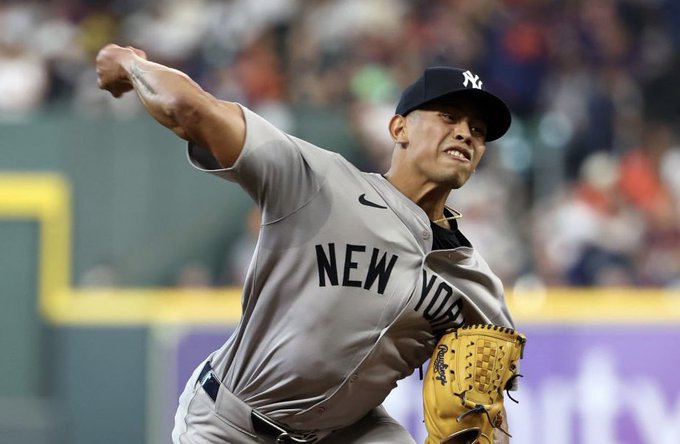
Complaints have piled on regarding the Nike-designed gray uniforms worn by teams when playing on the road. Fans are taking umbrage that the materials aren’t wicking away sweat.
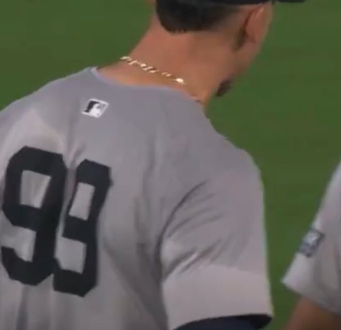
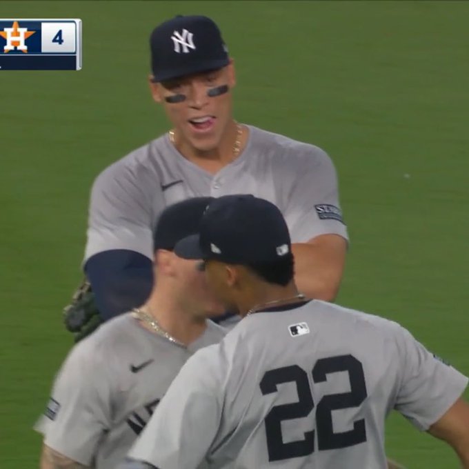
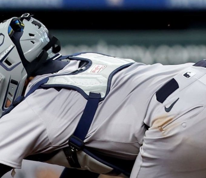
The result? Baseball players donning gray tops that have a darker shade above the waistline than they do below it. In other words, shirts are showing too much sweat.
The backlash reached its apex last weekend when fans observed an abundance of sweat in the gray uniforms worn by the New York Yankees game who were on the road against the Houston Astros. In a statement to The Athletic, Nike said they “have isolated the issue” and are “testing different options to lessen the moisture-related aesthetic color differences.”
Meanwhile, Nike’s intention has been to make the jersey more comfortable for players, especially during months when the temperature heat up.
MLB applauded Nike for their efforts in “bringing innovation and design improvements” while also pointing out adjustments that needed to be accounted for.
“Nike chose the letter sizing and picked the fabric that was used in these jerseys,” MLB said in a statement. “Fanatics has done a great job manufacturing everything to the exact specifications provided by Nike. As part of this significant transition, Nike will continue to explore necessary adjustments to certain elements of the new uniforms to meet the needs of MLB Clubs and players.”
Fanatics founder Michael Rubin said the changes were made “for all the right reasons” after getting feedback from players who wanted material more breathable and stretchable.
Early complaints when the uniforms were first unveiled centered around the pants being “see-through.” The disappointment continued regarding the smaller font on the jersey nameplates.


